The Psychology of Color Design for the Web
“I found I could say things with color and shapes that I couldn’t say any other way – things I had no words for.” Georgia O’Keeffe
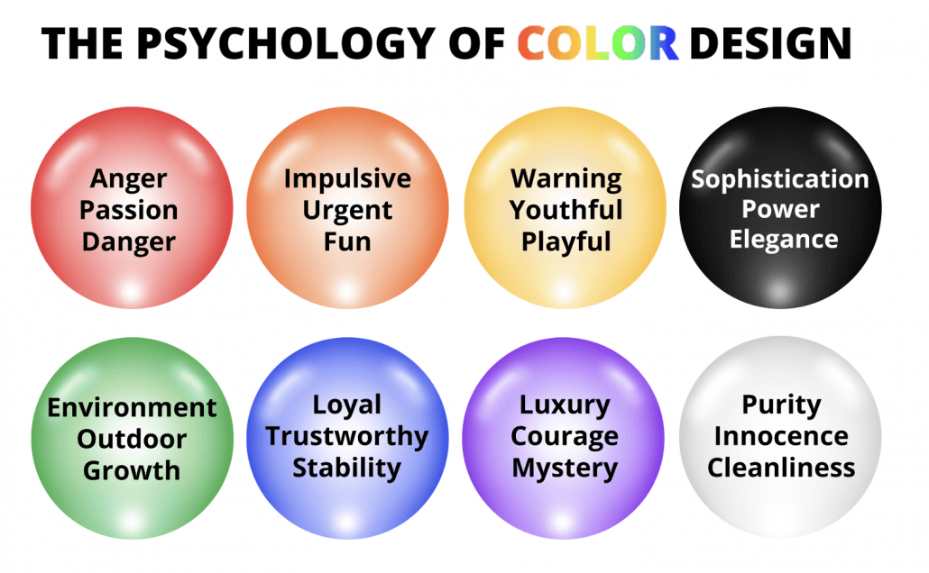
Color is a visual perception that enables us to differentiate between objects and to assign meanings to them. Colors evoke an emotional reaction that affects our attitudes and behaviors more than we may realize.
Website design involves more than aesthetically pleasing color combinations. The colors you choose on your website can affect the actions users take. Depending on which colors you choose for your site, you can influence visitors’ moods and behaviors. According to a recent study, adjusting color on your website can increase conversions by as much as 24%
Color psychology is a part of behavioral psychology because it studies how human emotions and actions are affected by color. As marketers, we can use color psychology to incite emotion in our consumers when they see branding colors on our website, logo, CTA buttons, and advertisements.
When using color psychology, you need to be aware of not only every color’s effect but also how that changes based on demographic and personal experiences. Colors can awaken different parts of the brain, triggering a variety of responses; this is why color holds so much power. Our subconscious is what reacts to different color combinations springing us into action based on our instincts and emotions.
Every color has positive and negative emotions associated with it. This means that depending on your industry, product, and demographics, you can use colors to evoke different reactions on your website.
Tradition has stated that pink is considered a girl’s color and blue a boy’s color, but when it comes to color psychology, this does not apply. Differences do exist in what colors appeal to men and women, so use this knowledge when designing websites and logos. According to research from Kissmetrics, colors that appeal most to women are blue, purple, and green, while orange, brown, and gray are the least appealing. As a marketer, consider your target demographic and which colors will appeal most to your target audience, so you can grab their attention and keep them interested in your website.
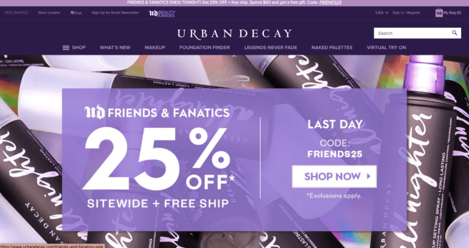
We can see this prominently in Urban Decay’s branding of their website. The trendy beauty brand displays purple prominently across its website, products, and logo. Their dominant use of purple achieves two goals: the first is that it appeals to their target market, women. The second is that purple is used to signify opulence and luxury, which perfectly drives Urban Decay’s identity as a prestigious beauty brand.
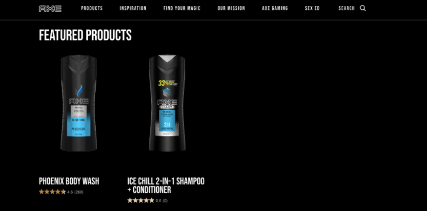
Men are said to prefer blue, green, and black, while brown, orange, and purple were their least favorites. Brands that market to men should keep this in mind when deciding on their website color palette. AXE.com is a well-known men’s grooming company that uses black heavily in its branding and pops of blue, which is another popular color with the male demographic. Black is associated with power and elegance, a great message to convey to men when selling deodorants or cologne because that is what you want them to feel when using your products. This associates your brand with positive feelings of confidence so customers will keep coming for more.
How to Leverage Color Psychology to Increase Conversions
Color psychology may seem complicated, but if you start asking yourself questions like “who’s my target audience?” and “what perception do I want my consumers to have of my branded website?”, you can start to narrow down which colors will work best for your website styling and design.
Let’s say your goal is to position yourself as a leader in the finance industry. You probably want to establish trust with your consumers and be perceived as a credible company. There are a few colors you can combine to incite these emotions with your Web design. Blue is a great color because it is associated with trust and stability, perfect for a financial institution because it can give your customers the perception that they can trust you with their money. Green is also a popular color in this industry because it is associated with growth and affluence. You may want your customer to have the perception that you can offer them prosperity with their finances. CapitalOne.com or Fidelity.com are good examples of financial websites using dominant green.
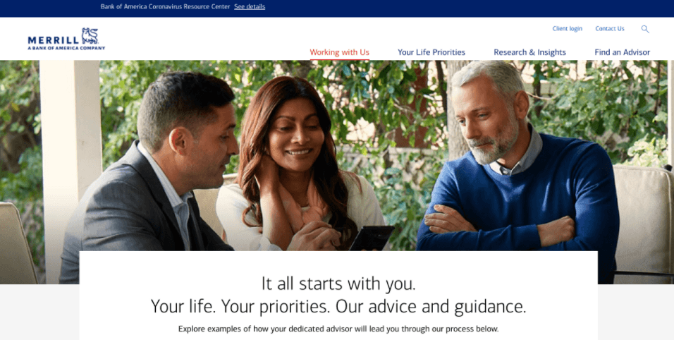
Merrill Lynch uses blue as their primary branding color on their website. As a wealth management organization, blue allows them to show their consumers that they can trust them to manage their finances. You can also see pops of red links and buttons on their website because red is a great color to incite action or attract consumers’ eyes. The balance of blue and red on Merrill Lynch’s website inspires trust and engagement on their website. Bankofamerica.com offers another example of this strategy.
Not all colors are industry-specific, but they are still associated with powerful meanings that your brand can leverage. Colors can be versatile and have various meanings, but depending on how you use them will send a particular message to your website users. If you are looking for your brand to be associated with positivity and happiness, yellow can be the perfect color for your branding elements. Yellow can also be a subtle call to action when used in isolated areas on websites. Make sure to use yellow sparingly because if overused, yellow can incite feelings of anxiety.
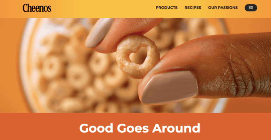
Cheerios.com uses yellow well because it combines it with great complementary color, orange. Yellow can be associated with cheerfulness which is excellent to represent Cheerios. Their website also uses orange because it can bring about feelings of youthfulness, which goes along with Cheerios’ message of keeping your heart healthy!
Red is a difficult color to use as a primary branding color because it can incite negative emotions like rage, anger, and danger. However, it can still benefit you when used moderately on your website. Red is a call to action and attention grabber color. In fact, in a study done by Hubspot, “The red button outperformed the green button by 21%.” It would be wise to use this color on buttons that say things like: apply now, sale, or other areas on your website requiring urgent attention.
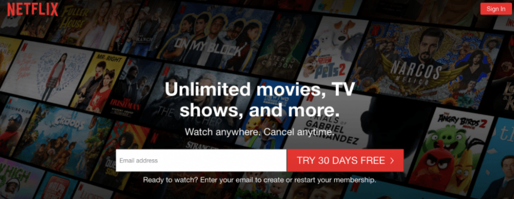
Netflix uses red as their logo color but it isn’t prominent on their website making it perfect to attract consumers’ attention while inciting a feeling of urgency. Besides the logo, red is only used on the “Sign In” and “Try 30 Days Free” buttons which are actions that Netflix wants their customers to act on.
Getting started using colors to leverage conversion rates may seem overwhelming if you are not a graphic designer or a branding expert. For example, yellow is proven to make people feel hungry while red is a passionate color, so combined, it makes for a feeling of passionate hunger perfect if you’re trying to sell food. Which is why McDonald’s and Wendy’s leverage these two colors excessively in their banding. Blue does quite the opposite as it is associated with suppressing appetite.
Here a few universal principles of color psychology to keep in mind when you optimize your website.
A color’s shade and tone can have very different meanings.
Not all shades of color are associated with the same meaning; therefore, before choosing a branding color, make sure the tone matches the intent of your message.
Use Green for your company if you are promoting eco-friendly or organic initiatives.
Green is strongly associated with nature, which makes it the perfect pick to be the color of your eco-friendly campaigns. Consumers’ will automatically associate your company as an eco-friendly company. It is also associated with money thanks to the color of the American Dollar.
Studies show that men generally prefer bold colors, while women prefer softer colors.
This is an excellent tip if you have a specific demographic because you can play with the shades and tints of your branding colors to attract your target audience. Men tend to favor shades, while women prefer tints of colors.
Brighter colors energize consumers while neutral colors relax them.
This tip can be helpful because you can coordinate your website colors depending on the response you want from your customers. If you want consumers to act fast, use bright colors, but if you want consumers to read your blog post, neutral tones will relax them so they can focus more on processing information.
Color psychology can dramatically increase website traffic, sales, and much more because “up to 90 percent of snap judgments made about products can be based on color alone (depending on the product).” This means that the right color combinations can have a significant payoff on these first website impressions.
Get started with your color strategy by analyzing your business needs and what message you want to convey to your consumers through your branding. Remember that to be successful in using colors as leverage in marketing, you need to pay attention to where you use specific colors, when you use them, to what audience, and what purpose will the colors serve.
To learn more about how you can leverage color psychology on your website, read about it in my new book, The Psychology of a Website: Mastering Cognitive Biases, Conversion Triggers, and Modern SEO for Massive Results, now available on Amazon in Paperback and Kindle.
Matthew Capala is a seasoned digital marketing executive, founder/CEO of Alphametic, a Miami-based digital marketing agency, author of “The Psychology of a Website,” dynamic speaker, and entrepreneur.


Leave a Reply
Want to join the discussion?Feel free to contribute!